
Responsive video element and codecs
Video ↑ is an example of using mave-clip integrated in the UI on monumental.co
While we’re all blown away how video production is rapidly changing due to evolving technologies, we’re also still trying to figure out how we put those videos on the web. Recently we received the question whether it is possible to get the raw mp4 file from our system, because that person wanted to use it as part of their UI. While this is possible, and you could in theory simply embed a raw mp4 file in your site, we explained how we developed our components to take advantage of multiple optimizations to give your users a better experience.
So, we figured it made sense to create a blog post about what our components actually do starting with <mave-clip> (read docs) and give you insight where video currently stands on the web in terms of showing it (and no, not generating it). And although we’re talking about our components library, which is our implementation, the same principles apply to any video you want to put on the web.
The problem
If you don’t know, you won’t really care. But once you know, you’ll care a lot. So let’s start with the problem. Videos aren’t as simple as images, although you would expect it to be, because it’s just a <video> element right? Well, there is a small difference between images and videos: it’s filesize. And you would only notice that when your users are not using that great connection you have, and/or browsing your site on a phone while taking a train ride.
Obviously you want to serve your video in the highest quality - but you also want it to be fast. Well… you can! But most of the time there are no multiple renditions or take care of multiple codecs to make sure your video is playable on all devices and browsers in the highest quality possible, using the least amount of data possible. And that’s where it gets complicated.
The solution
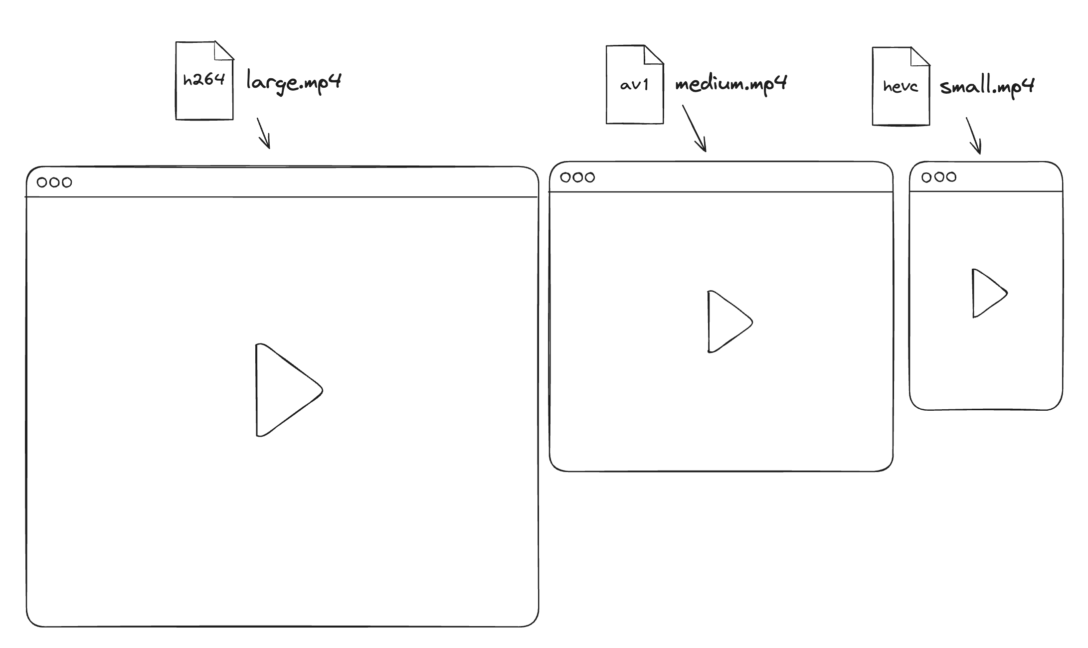
Scott Jehl wrote a great blog post on his site about responsive video (thanks @Florisch in our Discord for sharing this with us). As he indicates video “has a huge impact on performance, users’ data costs, sites’ hosting costs, and overall energy usage.” So, his post is a great start on how to implement the solution for different responsive video sources. It’s by using media queries, a CSS trick that recently got support by all major browsers in the <video> element. It is as simple as:
<video>
  <source src="large.mp4" media="(max-width: 1280px)" />
  <source src="medium.mp4" media="(max-width: 1080px)" />
  <source src="small.mp4" media="(max-width: 720px)" />
  <!-- Fallback if your browser doesn't support media query in source -->
  <source src="medium.mp4" />
</video>
When uploading to mave.io we create those different renditions for you. So depending on your device width, we can serve the right video. But that’s not all.
Without compromising the quality, we can decrease the filesize per video resolution too. And that has to do with the use of different codecs. Most videos on the web are using the h264 codec nowadays, which is broadly supported. But with the introduction HVEC (adopted by Apple), and AV1 (adopted by Google) there are more options that can be used in browsers. Using a specific codec filesize can be decreased by 50% or more compared to h264, which makes a even bigger impact no matter the resolution!
The downside however to this that it’s not supported by the <video> element (yet?), as we did with the media query. We will need to implement some Javascript to switch codec based on the browser. The reasoning behind this is that some browsers support multiple codecs, and you want to optimize it by choosing the best one for that specific browser, so we’re removing a source using a specific codec when it’s better to choose another one. This is a bit more complicated, but it’s definitely worth it.
Our (pseudo) implementation
To do this we have to prepare the multiple renditions, creating multiple sizes, but also creating each size with multiple codecs. Once you have that we run something like the following code to get the best sources:
// We give back the codec the browser prefers
// and give h264 as fallback
function getCodecs() {
  const ua = navigator.userAgent;
  const isEdgeOnMac = /Edg/.test(ua) && /Mac OS/.test(ua);
  const isSafari = /Safari/.test(ua) && !/Chrome/.test(ua);
  const isMacOS = /Mac OS/.test(ua);
  const isIOS = /iPhone|iPad/.test(ua);

  if ((isMacOS && (isSafari || isEdgeOnMac)) || isIOS) {
    return ["hevc", "h264"];
  }

  // Default to av1, h264 for all other combinations
  return ["av1", "h264"];
}

function getBestSources(sources) {
  return getCodecs().map((codec) =>
    sources.find((source) => source.type == codec)
  );
}

// Imaging giving it an array of source with
// the codecs defined and a list of multiple sizes, like:
const mySources = [
  { src: "h264.mp4", type: "h264" },
  { src: "av1.mp4", type: "av1" },
  { src: "hevc.mp4", type: "hevc" },
];

const sizes = [
  { name: "large", width: 1920 },
  { name: "medium", width: 1280 },
  { name: "small", width: 720 },
];

const bestSources = getBestSources(mySources);

// Now you can use the bestSources to create
// your video element using in multiple sizes
bestSources.forEach((source) => {
  sizes.forEach((size) => {
    const video = document.createElement("video");
    const sourceElement = document.createElement("source");

    sourceElement.src = `${size.name}_${source.src}`;
    sourceElement.type = "video/mp4";
    sourceElement.media = `(max-width: ${size.width}px)`;

    video.appendChild(sourceElement);

    document.body.appendChild(video);
  });
});
When we combine that with the media query, we can serve the best video for the user’s device and browser. You don’t have to completely understand the code, but simply put: we check what codec you can support, go through your list of sources you’ve provided (resolution and codec) and generated an HTML <video> element as illustrated above.
If you’re looking for an easier solution, you can use our <mave-clip> component were we do it for you, the only thing you do is upload your video to our service and you’re set. And we even throw in lazy loading - so your video is only loaded when it’s going to be in the viewport.
That’s it. I know it’s not that impressive as generated video, but still - it’s kinda cool. You have a responsive video element with the best quality and the least amount of data possible.
