components
Upload component
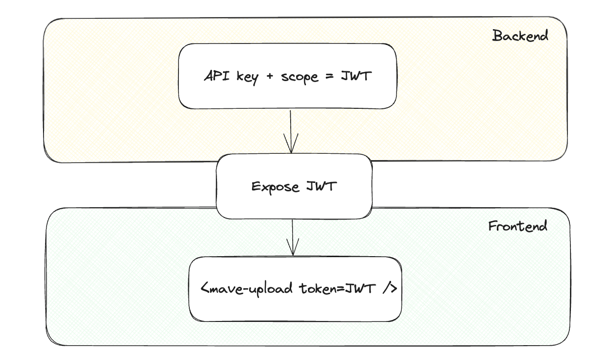
The upload component allows you to upload directly from your site. The only thing you need is our component library and a generated JWT token.
<script
  type="module"
  src="https://cdn.video-dns.com/npm/@maveio/components/+esm"
></script>

<mave-upload token="<token>"></mave-upload>
The token required is a generated JWT (JSON Web Token) using the API key provided by mave.
Depending on what you set as sub you can determine what to do. You can see this as the scope of the upload:
sub: {space id}: adds a new video to the spacesub: {collection id}: adds a new video to the collectionsub: {embed id}: replaces the video with a the upload
Your space id can be found in settings: developers and the collection id can be found on the page of the collection itself, underneath the title.
Alhough you can generate a “static” JWT, we would recommended creating temporary JWTs with an expiration date. This way you can revoke the JWT at any time and prevent abuse. This is how you can implement this:
While the following example demonstrates the usage in a node.js environment, JWT is widely supported across various languages and frameworks:
// server
const jwt = require("jsonwebtoken");

const token = jwt.sign(
  {
    sub: "XD9HPRtkDDmENLeVy9ripU", // space, collection or embed can be specified
    exp: 1680795697, // until when the user can upload
  },
  "SHJmNHhXNnFublZXajNCNllYUmhoTTpUVDRqZ3ZqYWJtOEtVbmNFb2h2d1RY" // API key
);

// return `token` to frontend
Note: Allowing to upload without an exp means this upload component will always (until you revoke your API key) be valid. We highly recommend using an appropriate exp to prevent abuse.
Once the token is added to <mave-upload token="{token}" /> the upload component will be active and ready to use.
Properties
| Property | Description |
|---|---|
| token | The generated JWT token (additionally you can point to embed or collection). |
| locale | Defaults to en, but you can provide nl, de or fr which changes the language within the default component. |
| color | Defaults to blue, but providing a color you can change the color of the button. |
| radius | You can change the radius of the button when providing this value. |
| font | You can overwrite the font by providing this value. |
| disableCompletion | Disables the completion state. This is useful when you want to handle the completion yourself. |
Events
| Event | Description |
|---|---|
| completed | Trigger when the upload has been completed. When directly rendering a mave-player with this event it will show the original video file (not a processed rendition). |
| playable | Fired once a playable rendition is available. detail contains { embed }, letting you mount a <mave-player> as soon as streaming (first HLS rendition) is ready. |
| rendition | Called for each rendition that has been created. In detail the type of the rendition will be passed if you want to render something specific after (useful if you want to load a HLS version after upload for instance). |
| upload | Will be called directly when uploaded has started, not ready for rendering anything. |
| processing | Will be called directly when processing has started, not ready for rendering anything. |
| failed | When the upload has failed. |
| error | Emitted when the upload pipeline reports an error from the backend. detail contains { message }. |
| invalid | Fired for unsupported files. detail contains { file, reason, allowedExtensions, message } so you can surface specific guidance or reset your UI. |
| statechange | Fired whenever the internal state or progress updates. detail contains { state, progress, dragging, error } so you can drive custom UIs and error presentations. |
For example, to catch the upload in Javascript and replace it once the client has completed the upload, you can do the following:
const upload = document.querySelector("mave-upload");
upload.addEventListener("completed", (event) => {
  const player = document.createElement("mave-player");
  player.setAttribute("embed", event.detail.embed);
  upload.parentNode.replaceChild(player, upload);
});
Customising the interface
<mave-upload> still ships with defaults, but you can now provide your own markup for every phase of the upload flow by adding named slots.
<mave-upload token="<token>">
  <div slot="initial" class="initial-card">
    <h2>Upload your media</h2>
    <p>Drop a file or use the button below.</p>
    <button type="button" data-mave-upload-select>Choose a file</button>
  </div>

  <div slot="uploading" class="uploading-card">
    <div class="bar">
      <div class="bar__value" style="width: 0%"></div>
    </div>
    <span data-role="progress-value">0%</span>
  </div>

  <div slot="processing" class="processing-card">Processing…</div>
  <div slot="done" class="done-card">All set!</div>
  <div slot="error" class="error-card">
    <p>Something went wrong. Try again.</p>
    <button type="button" data-mave-upload-select>Try again</button>
  </div>
</mave-upload>
slot="initial" | "uploading" | "processing" | "done" | "error"decides which layout shows for that state.- Add
data-mave-upload-selectto an element inside the initial slot to open the built-in file picker. - Listen for
statechangeto react to progress or drag state changes.
const upload = document.querySelector("mave-upload");
const progressValue = upload.querySelector('[data-role="progress-value"]');
const progressBar = upload.querySelector(".bar__value");

upload.addEventListener("statechange", ({ detail }) => {
  const { state, progress, dragging } = detail;
  progressValue.textContent = `${progress}%`;
  progressBar.style.width = `${progress}%`;
  upload.toggleAttribute("drag-highlight", dragging);
});
Every state is also exposed on the host element so you can drive purely-CSS styling:
- Host attributes:
state="initial|uploading|processing|done|error",progress="0-100",drag-over,ready.
For example, if you want to highlight mave-upload when someone drags a file over it, you can do something like this:
mave-upload[drag-over] [slot="initial"] {
  box-shadow: inset 0 0 0 2px rgba(99, 102, 241, 0.5);
}
Methods
| Method | Description |
|---|---|
| reset() | When the upload has called completed you can reset it to allow another upload. |
React and Vue wrappers expose the same methods through refs, so you can call reset() (and other public methods) without dealing with the underlying custom element manually.
React
import { useRef } from "react";
import { Upload } from "@maveio/components/react";

const uploadRef = useRef<React.ElementRef<typeof Upload>>(null);

return <Upload ref={uploadRef} token="<token>" />;

// whenever you need to trigger a new upload
uploadRef.current?.reset();
Vue 3
<template>
  <Upload ref="upload" token="<token>" />
</template>

<script setup lang="ts">
import { ref } from "vue";
import { Upload } from "@maveio/components/vue";

const upload = ref<InstanceType<typeof Upload> | null>(null);

function triggerReset() {
  upload.value?.reset();
}
</script>
Complete example of customized upload component
Check out our example page on Github.
